Windows 8 Artist from 1stAveMachine on Vimeo.
In an age when thinking ‘different‘, is all too common.
Most of the commercials I review on this website, in some capacity promote unhealthy and destructive behavior to the consumer. I breakdown many elements in order to shed light on some of the tactics they used and the scientific rationale behind them, and their effectiveness. Some might argue that these mere commercials were deviously crafted towards the subconscious mind, teaching us narcissism and other harmful behaviors that have become socially acceptable. I for one am always hinting of what a perfect commercial would look like if tech brands did not use such underhanded tactics. That same principle of mine, often leads to debates that end up with a question aimed towards me. “What do you expect these tech brands to do? If they make a dull commercial, no one will buy their products!” So I found one out of the few commercials to nominate for recognition.
I believe this commercial deserves recognition as one example of how effective tech brand commercials should be crafted in order to promote positive behavior. (1) Show the product, (2) believable persona’s and their experiences; without the extra-terrestrial graphics, and ridicule. (3) Promote and reward constructive behavior, (4) Deter the constant promoting of addiction and dependent social behavior through a tech device based on customer frustration and inadequacies.
Microsoft Windows has suffered from the “Windows is complicated and technical” image for quite some time. With the launch of Windows 8, Microsoft’s goal is to convince consumers of its relevance in our lives. They produced a stimulating commercial to convey just that. I applauded them for taking the high-road and doing more of traditional persuasion of how useful the product can be. Too many competing tech brands have sunk to a new low in commercials over the last decade by making arguments with high fallacy content, using constant ridicule of their rivals, fact tampering and promoting narcissistic behaviors. Consumers are bombarded by commercials and products that all look and perform the same. Customers are fed promises of gaining admiration, developing creativity and social status through slogans and buzzwords such as; ‘thinking different’, ‘superior’ and ‘intelligent’ products. When it came to Microsoft, I did not expect them to do anything different, or even do it well when it came to commercials. This commercial, cleverly named, “Artist” proved me wrong.
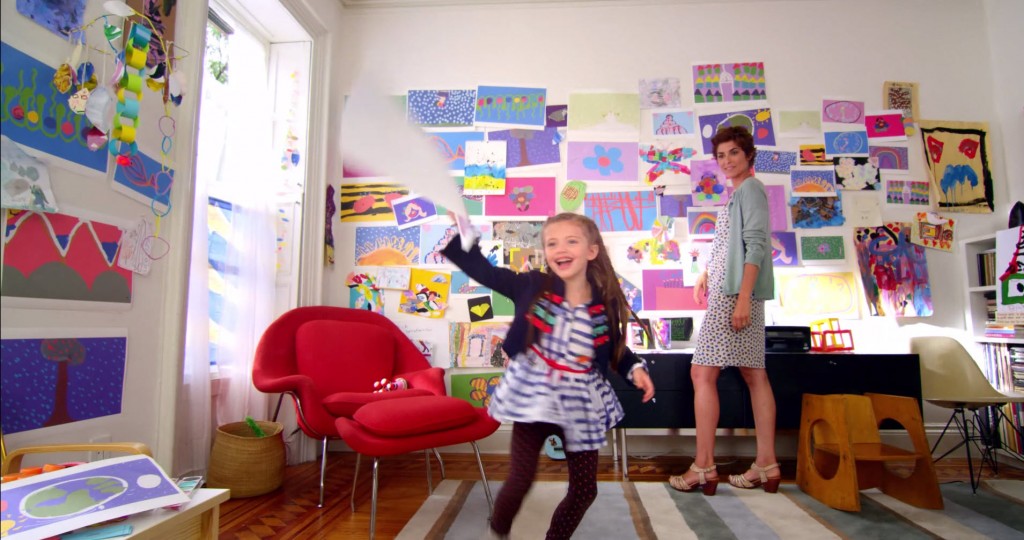
The plot is straightforward, “Mom places the family’s Windows 8 all-in-one PC on an easel and turns it into a canvas for her daughter.”- Microsoft YouTube Page.


With the guidance of her mom, a little girl paints on a Windows 8, Sony Touch Screen computer and simply uses their integrated features. When her dad calls on Skype, she then video chats with him and shows him the artwork she had printed out, and feels empowered throughout the whole experience. With a catchy tune in the background that goes so well with the story, this commercial has elements of how straight forward demonstration-marketing can be effectively turned into a commercial. Looking at YouTube and other places that track data on views and likes; this advertisement has been hugely successful. Let’s take a look at perhaps why.
Message
With all commercials there are conscious and subconscious messages to be conveyed to the consumer in the allotted time.
This commercial had at least two conscious messages, (1) Apps that inspire, we have some ‘inspiring’ apps too, check out this Fresh Paint app. (2) Look what consumers can do with Windows 8 and a touch screen Sony computer, and a Sensu Brush device. If you get a call from someone using Skype, you receive a notification and can easily switch to that app. Customers can simultaneously manage and combine two apps at the same time on one screen as an adjustable split screen.
Again, I’ll only choose a few subconscious messages, (1) “Express Yourself”, in a world where ‘Thinking Different’ was obviously a disguise to make us all thinking the same under another person’s vision, we all have the same if not similar devices. (2) Windows 8 is easy to use, so easy; a small child can do it too.
In my opinion, this commercial was primarily projected toward the “Millennials” (or also known as Generation Y), and the generations to follow. (http://en.wikipedia.org/wiki/Generation_Y)
Effects
Normal cuts and transitions, nothing unusual or over the top. Focus stays on the product and facial expressions of the main character.
Color
Multi-colored within the GUI and setting; however orange and white we see at the beginning and end of this commercial. Main colors where orange, purple and shades of blue. These colors of course mean something.
Orange- A color used to draw attention, has attributes of both red and yellow, you can use to create playfulness and stimulate emotional impulses, and even appetites. The color also shares an connection with words such as- Affordable, Creativity, Enthusiasm, Fun, Jovial, Lighthearted, High-Spirited, and Youthful.
Blue- Not just a color of calmness but also authority, security and success. The color also instills Confidence, Dignity, Loyalty, Power, Success, Trustworthiness and etc.
Purple- The color that implies royalty, mystery, sophistication. A color that has both cool and warm properties, it can also be seen in education and luxury related industries. Many relate the color with Ceremony, Expensive, Fantasy, Justice, Mystery, Nobility, Regal, Royalty, Sophistication, Spirituality, and etc.
Color Psychology in logo design- infographic by www.musedesigns.com
Composition
Setting is in the area of what appears to be a family room where a little girl paints using the Sensu Brush on a Sony Windows 8 Touch Screen computer, and her mom is in the background hanging up her printed works of art on the wall. (http://www.sensubrush.com/2012/windows-8-and-the-sensu-brush/)
The cameras stay focused on the touch screen, the girl’s expressions, and keeping the appearance that the mom is in the room supervising.
Audio
“Do what you do, do it good. It’s not what you look like, when you do it.” Perfect for audio subconscious message in the background. The background music tone and the lyrics match the action or what we see on the screen and sound effects. The song is a sample performed by Labyrinth, originally from 1971 song by Charles Wright & the Watts 103rd Street Rhythm Band. Though the message is not new, it is new for a Windows system. Personally, in a world of User Interfaces and Graphical User Interfaces all looking alike and causing somewhat of consumer confusion during purchasing decisions (source), it fills the need of at least looking decidedly recognizable than the competition. One of the various social concerns I have still remains; Can consumers truly express themselves with Windows 8 Apps? Are we once again told another catchy marketing slogan to make us believe in the Almighty Technology? Only time will tell. (https://www.youtube.com/watch?v=III3G1egUcU)
How many people had sung this song before (http://en.wikipedia.org/wiki/Express_Yourself)
Manipulation
In this case, it was minimal, yet generally effective. They are not trying to promote behavior with an indication of social status or some sort of superiority through ridiculing of the competition and addictive behaviors.
Though I would not recommend leaving your family computer on an easel like that, but at least the mom was there to supervise. Hopefully all consumers are able to buy good warranties with their computer purchases. (Warranties provided by such retailers as BestBuy, Sony, Apple and so on.)
This was obviously trying to convince consumers of the ease of use of the application, its multi-tasking capability, and family oriented features. As I stated before, Windows systems to some are a bit hard to figure out how to use still to this day, simply because it designed from programming logic and not human instinct. (references)
Persona
Personas, though they may be believable, are fictional characters put in place for consumers to relate to. In this commercial, I found the personas to be very relatable. This commercial did not use any condescending or ridiculing undertones to pass off as actual customer quotes or frustrations. Clean uses of personas are rare these days. Each persona has their own qualities, but the facial expressions of the daughter and seeing her accomplish various tasks throughout the commercial really pulls at the heart strings.
